

I’m a huge fan of Soviet-era designs and posters. The vibrant colours, the typography, and everything really speak to me in a weird way. So, I have always wanted to do something that is inspired by the Soviet era. And me being a typography enthusiast, that’s how Killaa came to be.
My goal was to do a “Sovietesque” Thaana typeface. But shortly after I started working on it, it became quite a challenging thing. I had to do a lot of research on how kerning, pairing, stems etc. work. But the thing was there wasn’t much to look at in the Thaana typeface “design space”. There are very few well-designed typefaces and almost nobody wrote about anything. So, I had to figure it out myself. I did email some people, but the responses weren’t that helpful. It’s almost like they want to guard this as a secret or something. This is why I thought I should write about my experience. (This isn’t a tutorial about all the technical things and the pieces of software. Just my general experience)
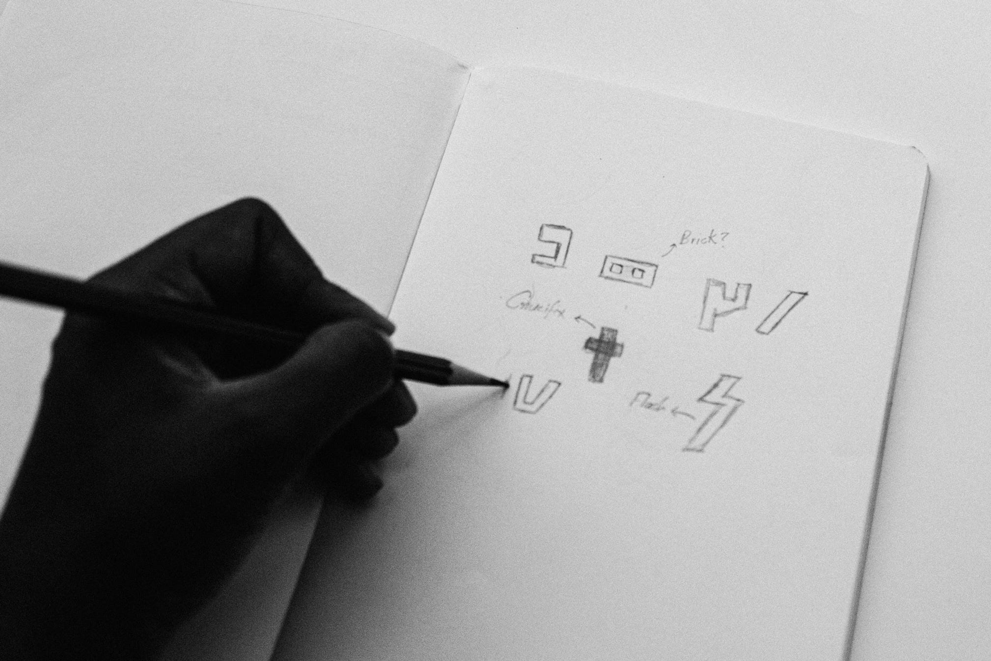
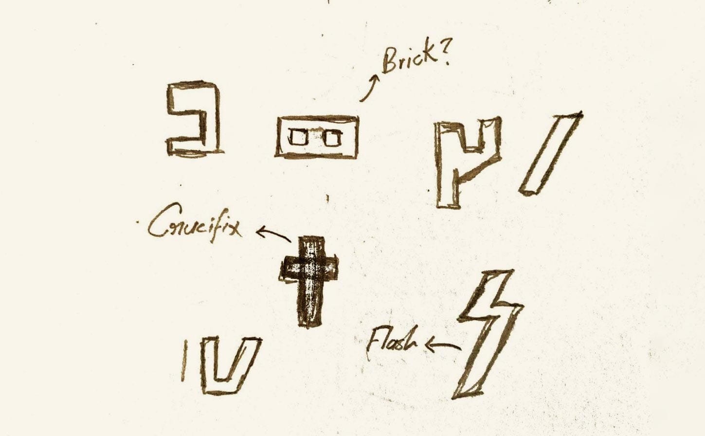
I never wanted to make a Thaana-Soviet typeface but a Soviet-Thaana typeface if that makes any sense. I wanted to make something that would actually be in use in that era if we were part of the Soviet Union. First I started sketching out some ideas I had in my head. Figuring out things that might work and things that might not. You get the idea.
Then I used Adobe Illustrator to make digitalize things. After that, I moved to Glyphs.

At first, I was perplexed using the interface but after some time I got really used to it. It just takes some time. So don’t be intimidated when you first start. There are many tutorials and courses online you could check out. I actually recommend you do that because it’s always good to have a basic knowledge of the software you use before starting to make something with it. And always read the official software documentation if you’re stuck. I don’t know why almost nobody reads that. Chances are you will find your solution and even more extra tips along with it. Because they know the software the most.
Making the base shapes
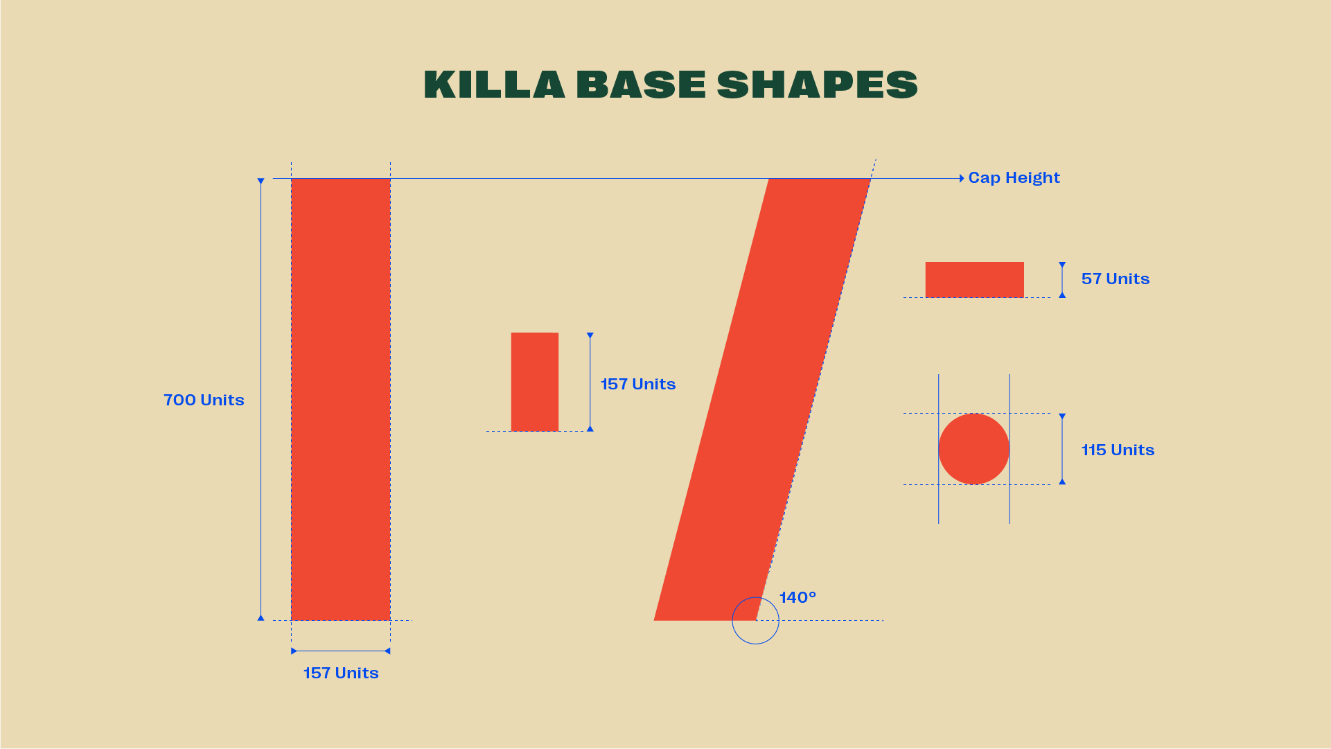
I decided to go with 157 units as the base shape width and just go from there.
Geometric vs Optical
“Designers are often troubled by optical illusions and aesthetics. An internal struggle takes place because trying to make something visually harmonious, optically aesthetic and functional is a difficult challenge. What the eye physically sees and what our mind perceives to see are two totally different things. Deciding on whether a node goes here or there has a direct impact to the final outcome of typeface design — regardless of style.” — FontSmith
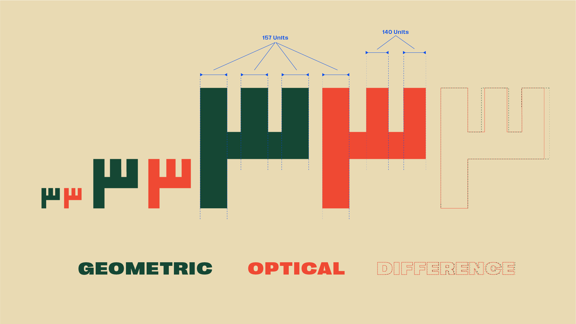
Although I wanted to make a semi-geometrical font I can’t just use the same sizes everywhere as you expect. Because the eye sees things very differently when size or distance is involved.
Typefaces with perfect circles, squares, and triangles don’t necessarily make for easy reading and aren’t very functional. Here is an example:
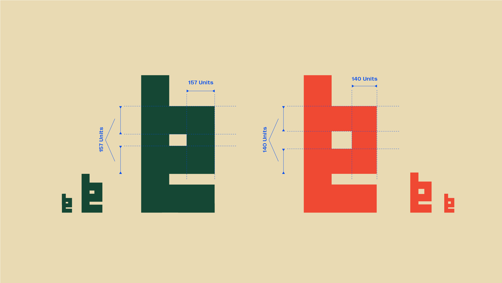
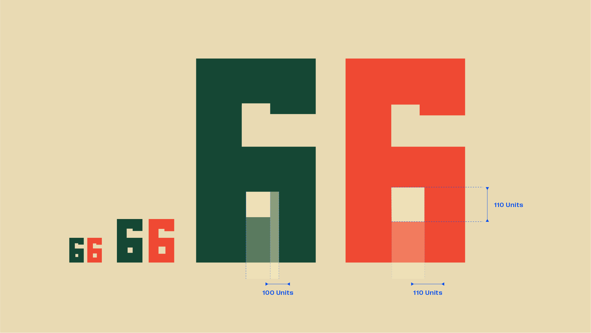
As you can see the one with 157 units everywhere looks weird especially when small. So, I had to change things a bit. A lot of trial and error basically. You can see more examples here:
You can read more about this here. They explain it better than I can.
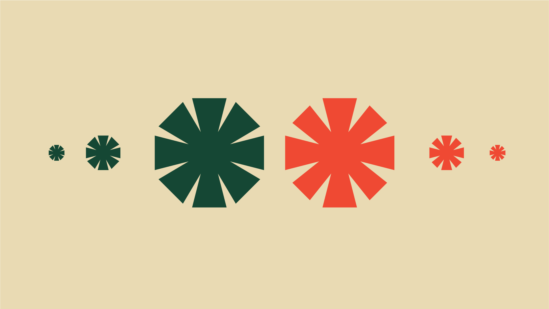
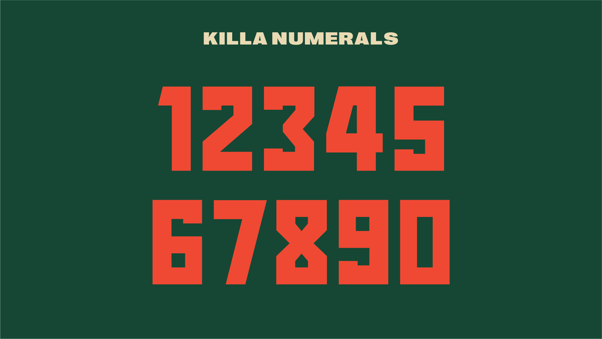
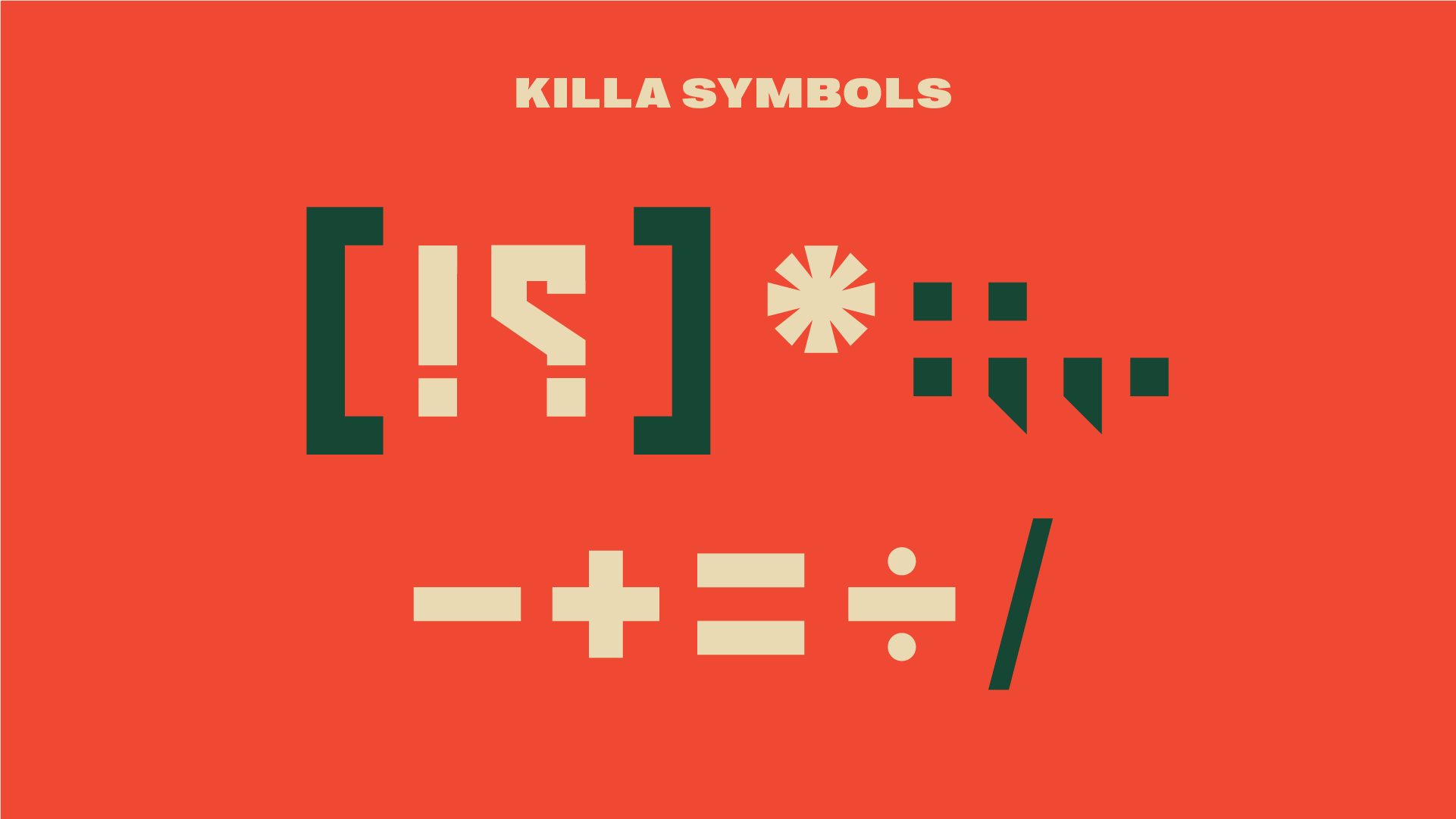
Numerals & Symbols
Made using the same techniques and fundamentals discussed above.
Why are there no diacritics (ފިލި)?

To be honest it just doesn’t look right and breaks the entire shapes of the alphabet. Therefore, after some thought, I decided not to add the diacritics. I did, however, experiment with many variations of it but in the end, it just didn’t feel right. Hopefully, you will see them in another typeface I’m making. It’s still a work in progress, so there is no release window or anything planned.
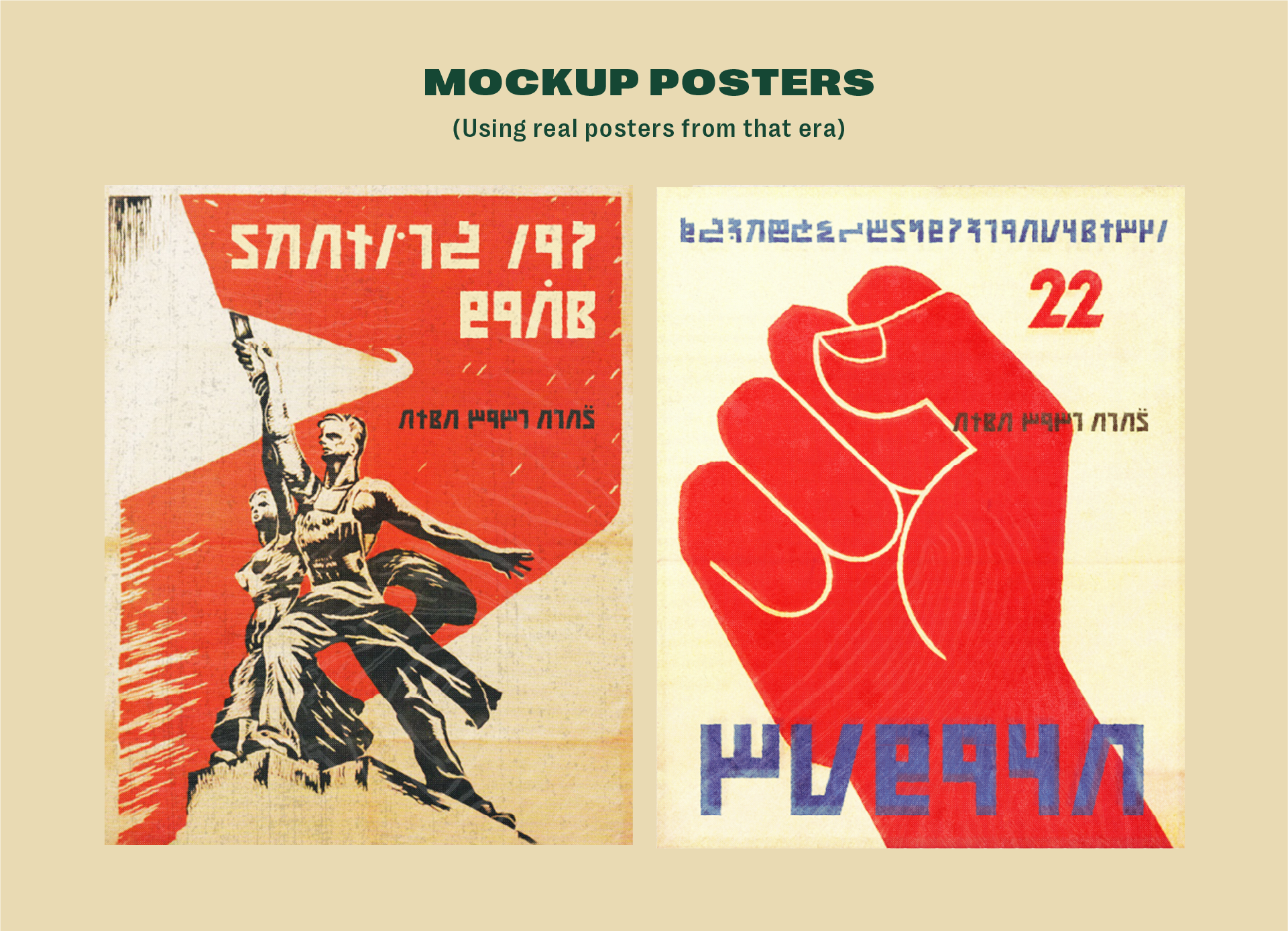
Soviet posters made with the typeface
Full details are available at the link below:
Source URL: Medium